Summary: Demonstrating how to line up radio buttons that have different heights in Android
Recently, a client requested that an Android app have some custom radio buttons added. Android radio buttons are similar to those you find on the web. They allow you to select one and only choice. Graphically, they are quite simple by default. Usually each button looks identical. Sometimes, people like to get fancy and include text or make some of the buttons larger or smaller. It is certainly possible to do these things in Android, but your first attempt may look rather ugly.
I created a simple project and added it to my github account to demonstrate the problem. Here is a button that’s supposed to appear at the left of the row of buttons. Notice it has some text below it:

Next, here’s a button that will appear in the middle of the row. It does not have any text in it, so its height is less than the other button:

When you first add these images as custom radio buttons to your Android app, you get something that’s a little bit ugly. This screenshot shows the problem: technically, your buttons are lined up in a row. However, visually, it looks like they are misaligned, because of the text in the outer buttons:
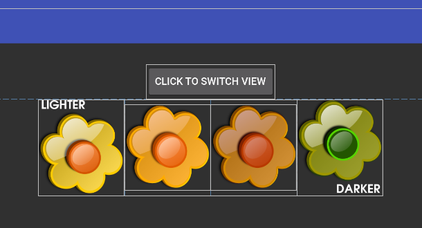
In the screenshot above, the different parts of the layout are highlighted in white to show you their boundaries. Clearly, the outermost buttons are taller than the inner ones.
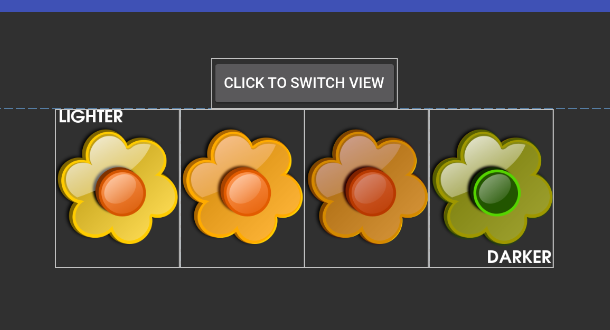
There are different ways to deal with this, but the simplest one is to rework your buttons so that they all have the same height. That’s what I did. Here are the two new buttons. They look identical, but now they have the same height. The second button is now taller, but it’s just padded with transparent fill.


The new buttons were created by adding each of the four flower images to a single canvas with a transparent background in Gimp (a graphics tool), making sure they were lined up along their center points. Then, a rectangle was sliced around the entire set of buttons, cropping as tightly as possible to avoid excessive space being taken up by any individual button. Then, each individual image was sliced out from the rectangle, keeping their heights all the same.
Once I had the new images, I replaced the old ones in my Android app. Here’s the result:
This is a good solution because you aren’t trying to force Android to realign the buttons programmatically. That can get tricky and isn’t really what Android is designed to do. When you add buttons in Android, it is recommended that you set their heights and widths in “dp” in the layout xml file. When writing the code to programmatically change image heights and widths, you’re dealing with pixels. It’s better to just avoid trying to make changes at the pixel level.
You can check out the entire project at github if you want to experiment with it.
[Edit October 2, 2018: It turns out that you can also solve this problem using Android’s ConstraintLayout. This adds a little bit of complexity to the layout, but it has the advantage that the button graphics do not have to be reworked. The github project includes code which demonstrates this option, as well.]
Thanks to inky2010 for making the flower images available in the public domain!